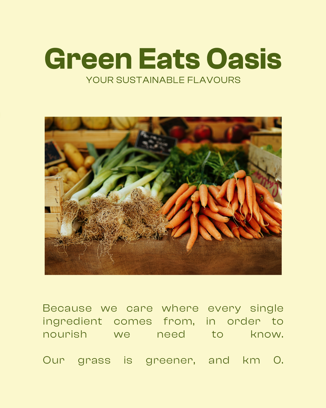
Green Eats Oasis, fresh, organic food, everyday!
Green Eats Oasis needed a brand identity that matched its mission: serving organic, wholesome food in a way that felt fresh and modern — not preachy or overly rustic. The challenge was to reflect their values clearly, while also standing out in a crowded market full of green logos and leafy clichés.
I focused on building a clean and minimal visual identity that feels both current and effortless. The branding avoids unnecessary complexity, instead it lets the core message speak for itself: simple, honest food that’s good for you and the planet (and KM0).
By keeping the design bold yet approachable, I made sure Green Eats Oasis looks as fresh as the food they serve, and feels instantly memorable from the first glance.
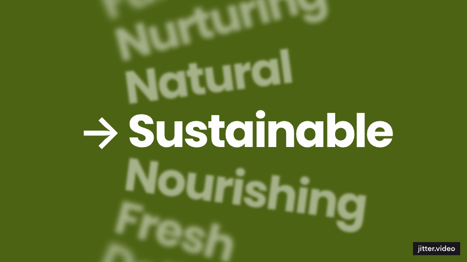


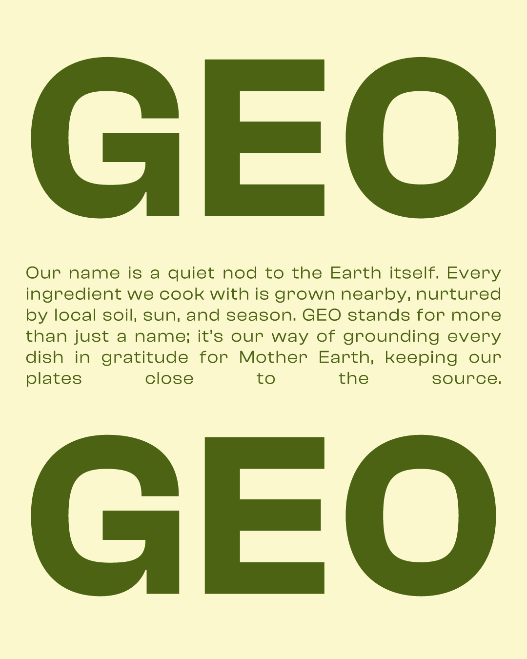

At the heart of the design is a subtle & distinctive modern flower shape, a symbol of natural growth and sustainability. Paired with a carefully chosen two color palette of butter yellow (the best ingredient) and deep leafy green, the branding feels bold but approachable so to allow it to stand out amongst all the competitors while staying true to the restaurant’s organic philosophy.
From signage to menus and packaging, every element of the brand had been designed to be clear, intentional, and instantly recognizable. The result is a brand identity that feels fresh, minimal, and true to the essence of Green Eats Oasis. Good food, grown naturally, served simply.